
Tableau Public and Infogr.am are two popular data visualization tools that I have been testing and learning recently. When it comes to producing interactive online charts, each tool has its pros and cons:
- Tableau is ideal for complex visualizations with customized features such as filters and search; Infogr.am is good for quick, basic interactive data visualization.
- Tableau is a program that needs to be downloaded and installed on a home PC (no mac version). Infogr.am is a web-based service, a user can access and work on his or her visualization project anytime, anywhere, on any computer.
- Infogr.am has a simple (web) interface and is easy to work with. Tableau, in comparison, is a seemingly daunting software program, with many menu commands and buttons, and demands a steep learning curve.
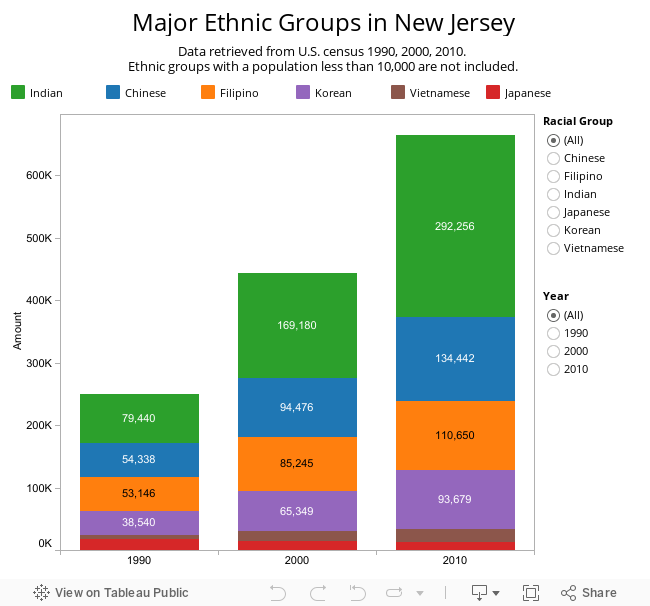
I created two visualizations of the growth trend of six major ethnic groups in New Jersey, using Tableau and infogr.am, respectively. And here’s some observations and thoughts.
Different requirements of data format
One thing worth noting that while infogr.am can work with a “normal” data set, Tableau requires the data set be formatted following specific guidelines. Take a look of the two versions of the same data set: the left one is formatted for Tableau Public, the one on the right is for infogr.am. Can you see the difference?


The (complex) Tableau interface vs. the (simple) infogram interface
Here are screen shots of interfaces of the two tools: First one is Tableau and second one is Infogram:


The (more interactive) Tableau visualization vs. the (basic) infogram visualization
Lastly, the two actual visualizations: first one is Tableau visualization; second one is infogram visualization.
Related posts: